Your landing page is the gateway to your webinar. It’s where your guests learn about your presentation and register to attend.
But your landing page isn’t something you can slap together in a few minutes. It deserves careful thought and optimization. If it doesn’t convert (turn visitors into registrants), no one will see your webinar. All the time, energy, and money you spent building your presentation will be wasted.
In this article, we’d like to give you a few ways to dramatically improve your registration page’s conversion rate.
1. You Can’t Please Everyone
It’s tempting to design your landing page to appeal to everyone. If you reach a larger group of people, you’ll gain more webinar guests and ultimately more customers, right?
Unfortunately, no.
Watering down your copy and imagery to appeal to a larger group prevents you from connecting with the people who will get the most value from your webinar and eventually become customers.
Besides, too much information can actually work against you.
Few people are willing to read a 2,000-word essay on the benefits of your webinar. They want short, easy-to-digest information that clearly articulates your value. If they have to read a novel just to decide if they should register, they’ll quickly decide your webinar isn’t right for them.
Don’t be afraid to use a word or image most people don’t understand. Just make sure your audience understands it.
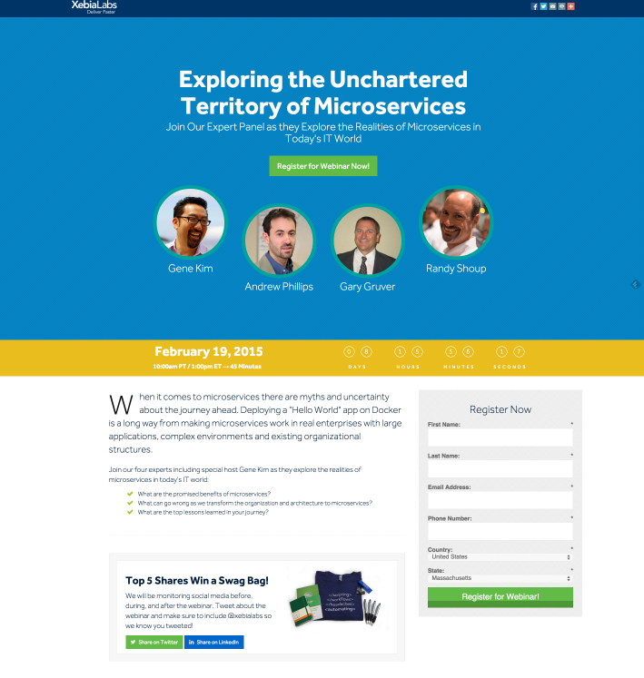
For instance, this webinar’s registration page uses the word “microservices.” Most people don’t know what that means, and you can’t figure it out by the context here. This webinar is not trying to please everyone.
2. Explain the Benefits and Your USP
One of the oldest marketing truisms is “Sell the benefits, not the features.” That’s applicable to webinars, too.
Your customers don’t really care about the features of your webinar. They want to know how it benefits them. They want to know what they’ll get out of the experience and how their lives will be better.
For instance, no one cares that your presentation has “7 exciting chapters!” That’s a feature. It doesn’t tell potential attendees how they’ll benefit from your webinar and why it’s worth their time.
To determine how your webinar will benefit your guests, think about their problems. What is their ultimate reason for seeking out your webinar?
Furthermore, it’s important to emphasize what makes your webinar unique. Why should someone attend your presentation over another?
This is your unique selling proposition (USP) – a way to stand out from your competitors.
Are you an industry expert? Do you have a guest speaker who is? Do you approach a problem from a new or unusual angle? Are you giving out a complete system they can implement on their own afterward?
If you don’t have a USP, you might want to consider reworking your webinar to give it something unique.
3. Focus on Your Headline
Your headline is the most valuable piece of copy on your landing page.
According to Copyblogger, 80% of people will read your headline, but only 20% of people will read anything else on your page.
If you don’t get your headline right, the rest of your page doesn’t really matter at all. It’s your strongest opportunity to capture their attention and drive them to register.
Your headline should exhibit your webinar’s benefits and USP. It should be compelling and enticing, but not vague. It should make people think, “Wow, I need to know that.”
Here are some more tips for great webinar headlines:
- Think about the visitor’s problem. Try to acknowledge it in your headline.
- Don’t be afraid to use a trendy or pop culture reference. Just make sure your audience understands it.
- Ask a question around the problem you solve, but don’t ask one that can be answered with a “yes” or a “no.”
- Use SEO keywords so search engines (Google, namely) pick up your page.
Here are some great webinar titles for inspiration:
- How to Promote Your Etsy Business Like a Marketing Pro
- 4 Steps to Email Marketing that Converts
- Instagram Ads 101: From Creating Great Ads to Boosting Click-Through Rate
- How to Personalize the Buyer Experience with Sales and Marketing
- Video Ad Trends Changing the Way We Connect with Brands
- New Facebook Strategies to Attract More Likes and Followers
- The Science of Creating Must-Click Content on Twitter
You might find it useful to include a subheading beneath your headline. This is an opportunity to be clearer about your webinar’s topic, but you should still be emotionally forceful. Tell your visitors exactly what they’ll learn and entice them to read the rest of the page. Sometimes it helps to write your subheading before your headline.
4. Limit the Number of Attendees
Marketers have used the scarcity principle to drive conversions for ages. Webinars are no exception.
The scarcity principle refers to our tendency to place a higher value on things we perceive as rare or limited. Similarly, we place a lower value on things that are common or plentiful.
You’ve probably seen marketing phrases like “Available until supplies last” or “Limited time offer.” This type of language drives people to make decisions quickly due to the fear of missing out.
Your registration page can take advantage of this effect by limiting the number of seats in your webinar.
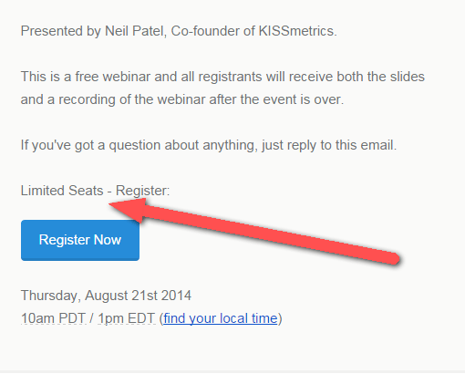
Digital marketing icon Neil Patel does this often in an elegant way.
This technique seems counterproductive, but it has the power to encourage people to sign up sooner. It also increases their likeliness to attend the webinar because they won’t want to miss the chance to be part of the exclusive group.
Now, you don’t have to really limit the number of seats in your webinar. You could just say seats are limited to drive more conversions.
But there’s a lot of power in actually limiting the number of guests, especially if you can add the declining count to the registration page. Guests who make it into your webinar will appreciate the chance to be part of the group. Guests who don’t make it in will keep their eyes open for the next one.
5. Use a Single Call to Action
The form visitors use to sign up is the page’s call to action. It should be prominent, obvious, and positioned near the top of the page so no one misses it.
It helps to use one or several tricks to draw the visitors’ eyes toward the form. You could…
- Give the form a unique background color or drop shadow to make it stand out.
- Use subtle clues like arrows to direct people to the form.
- Position the form slightly off the center of a background layer so it “breaks” the page’s design.
Your form’s “submit” button should use a color that contrasts with the rest of the page as well as action-focused language, like “Register Now” or “Join the Webinar.”
Most importantly, the call to action should be the only element of your page your visitors can interact with.
Don’t add links to any other pages or resources (and especially don’t link off your website). It even helps to strip the header and footer from your landing page so there’s only one direction for your visitors to go.
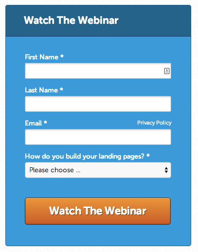
Generally, your form should be as simple as possible. Only ask for their name and email because that’s usually all you need. More questions on your form reduce the number of people who complete it.
However, Georgiana Laudi, the director of marketing at Unbounce (a landing page software tool), recommends asking participants one question that pertains to the webinar’s topic.
“Asking people to participate in advance (by submitting questions, for example) is a great way to help build out the webinar content and get extra ‘buy-in’ from registrants,” she says.
Going Forward
We’ve given you some simple tips to improve your webinar registration pages. If you apply these secrets to your landing pages, you’ll see noticeable boosts in your conversion rates.
Getting prospects into your webinar is only half the battle. Make sure you use the best webinar plugin for WordPress to give your guests a positive experience. Learn more.


